Client: Abecrombie & Kent
Role: UX, Art Direction, Design
Team: Senior Art Director, Front-end and Back-end Engineer team, additional off-shore Engineer and QA team, and Project Manager
The ask
Abecrombie & Kent is a luxury adventure travel company. With excursions spanning over 30 countries and a wide variety of travel packages A&K was looking to improve their blog experience by creating a unique discovery experience for their audience.
With an audience skewing heavily to the older, more affluent side, with minimal mobile use the client wanted a clean, luxurious blog with an intuitive experience. The client was producing a large quantity of content and growing. With this content their goal was to inspire prospects and ultimately cross sell their travel experiences.
Initial wires exploring design direction for the blog homepage redesign
The approach
The client’s homepage was part of another refresh project for the Rightpoint team so we were very familiar with the brand and their audience. For this project, our focus was on the discovery experience. We identified 2 segments of users, users who know what they are looking for, and curious users.
To create this experience we approached the redesign with a reductive mindset, removing features and components that didn’t add value and distracted users from getting to content quicker. Content needed to shine so brought more focus to it by creating groupings and features, rather than the infinite scroll aggregator experience the current site has. To this we:
removed their secondary navigation that was causing confusion and not adding value to the site experience due to lack of connection to the content.
removed their right rail which contained a category wall of tags. This allowed us to open the site margins to create clean space associated with luxury.
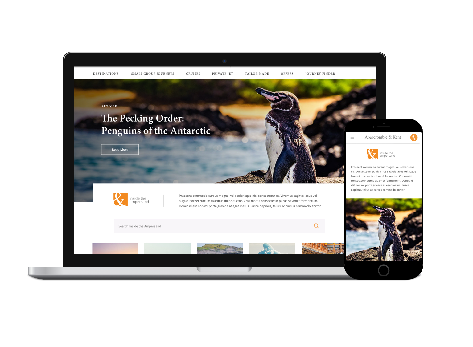
carried over their homepage editorial style design, using feature blocks to call out curated content. We brought focus to their photography by increasing the size of image components. We focused on legibility of content, keeping copy to a minima and creating strong CTAs.
created a higher touch point of discovery we moved the search bar to the top of the page where it more visible to the user. This allowed both our segments access to search content, both specifically or casually.
created a visual filter to allow users to browse by content category type.
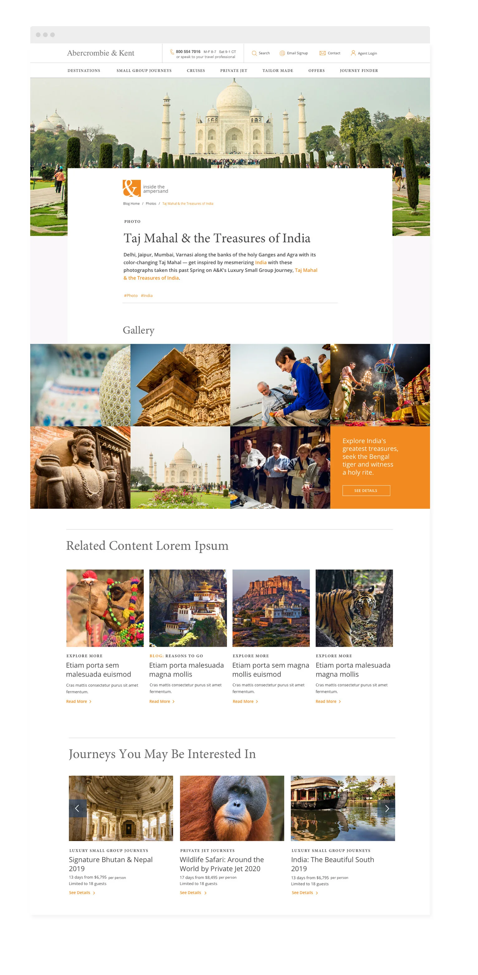
leveraged existing related content components to add cross sell function serving up related trip excursions and related blog content.
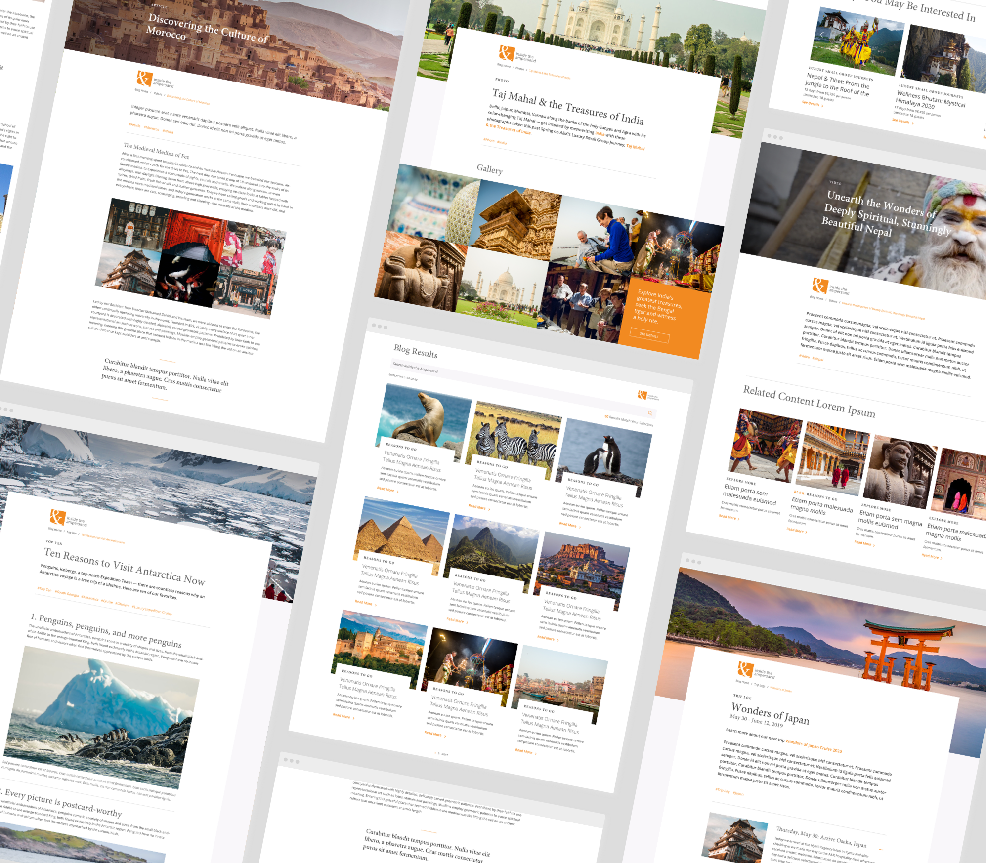
The project included redesigning the blog landing page and 5 content type templates. The project went into development after my time with the client passed.


